children: PropTypes.node, // type can be things like text, password, (typical input types) as well as select and textarea, providing children as you normally would to those. type: PropTypes.string, size: PropTypes.string, bsSize: PropTypes.string, state: deprecated(PropTypes.string, 'Please use the prop "valid"'), valid: PropTypes.bool, // applied the is-valid class when true, does nothing when false invalid: PropTypes.bool, // applied the is-invalid class when true, does nothing when false tag: PropTypes.oneOfType([PropTypes.func, PropTypes.string]), // ref will only get you a reference to the Input component, use innerRef to get a reference to the DOM input (for things like focus management). innerRef: PropTypes.oneOfType([PropTypes.func, PropTypes.string]), static: deprecated(PropTypes.bool, 'Please use the prop "plaintext"'), plaintext: PropTypes.bool, addon: PropTypes.bool, className: PropTypes.string, cssModule: PropTypes.object,};CustomInput.propTypes = { className: PropTypes.string, id: PropTypes.oneOfType([PropTypes.string, PropTypes.number]).isRequired, type: PropTypes.string.isRequired, // radio, checkbox, select, range. label: PropTypes.string, // used for checkbox and radios inline: PropTypes.bool, valid: PropTypes.bool, // applied the is-valid class when true, does nothing when false invalid: PropTypes.bool, // applied the is-invalid class when true, does nothing when false bsSize: PropTypes.string, cssModule: PropTypes.object, children: PropTypes.oneOfType([PropTypes.node, PropTypes.array, PropTypes.func]), // for type="select" // innerRef would be referenced to select node or input DOM node, depends on type property innerRef: PropTypes.oneOfType([ PropTypes.object, PropTypes.string, PropTypes.func, ])};Form.propTypes = { children: PropTypes.node, inline: PropTypes.bool, // Pass in a Component to override default element tag: PropTypes.oneOfType([PropTypes.func, PropTypes.string]), // default: 'form' innerRef: PropTypes.oneOfType([PropTypes.object, PropTypes.func, PropTypes.string]), className: PropTypes.string, cssModule: PropTypes.object,};FormFeedback.propTypes = { children: PropTypes.node, // Pass in a Component to override default element tag: PropTypes.string, // default: 'div' className: PropTypes.string, cssModule: PropTypes.object, valid: PropTypes.bool, // default: undefined tooltip: PropTypes.bool};FormGroup.propTypes = { children: PropTypes.node, // Applied the row class when true, does nothing when false row: PropTypes.bool, // Applied the form-check class when true, form-group when false check: PropTypes.bool, inline: PropTypes.bool, // Applied the disabled class when the check and disabled props are true, does nothing when false disabled: PropTypes.bool, // Pass in a Component to override default element tag: PropTypes.string, // default: 'div' className: PropTypes.string, cssModule: PropTypes.object,};FormText.propTypes = { children: PropTypes.node, inline: PropTypes.bool, // Pass in a Component to override default element tag: PropTypes.oneOfType([PropTypes.func, PropTypes.string]), // default: 'small' color: PropTypes.string, // default: 'muted' className: PropTypes.string, cssModule: PropTypes.object,};
Form Grid
import React from 'react';import { Col, Button, Form, FormGroup, Label, Input, FormText } from 'reactstrap';export default class Example extends React.Component { render() { return ( <Form> <FormGroup row> <Label for="exampleEmail" sm={2}>Email</Label> <Col sm={10}> <Input type="email" name="email" id="exampleEmail" placeholder="with a placeholder" /> </Col> </FormGroup> <FormGroup row> <Label for="examplePassword" sm={2}>Password</Label> <Col sm={10}> <Input type="password" name="password" id="examplePassword" placeholder="password placeholder" /> </Col> </FormGroup> <FormGroup row> <Label for="exampleSelect" sm={2}>Select</Label> <Col sm={10}> <Input type="select" name="select" id="exampleSelect" /> </Col> </FormGroup> <FormGroup row> <Label for="exampleSelectMulti" sm={2}>Select Multiple</Label> <Col sm={10}> <Input type="select" name="selectMulti" id="exampleSelectMulti" multiple /> </Col> </FormGroup> <FormGroup row> <Label for="exampleText" sm={2}>Text Area</Label> <Col sm={10}> <Input type="textarea" name="text" id="exampleText" /> </Col> </FormGroup> <FormGroup row> <Label for="exampleFile" sm={2}>File</Label> <Col sm={10}> <Input type="file" name="file" id="exampleFile" /> <FormText color="muted"> This is some placeholder block-level help text for the above input. It's a bit lighter and easily wraps to a new line. </FormText> </Col> </FormGroup> <FormGroup tag="fieldset" row> <legend className="col-form-label col-sm-2">Radio Buttons</legend> <Col sm={10}> <FormGroup check> <Label check> <Input type="radio" name="radio2" />{' '} Option one is this and that—be sure to include why it's great </Label> </FormGroup> <FormGroup check> <Label check> <Input type="radio" name="radio2" />{' '} Option two can be something else and selecting it will deselect option one </Label> </FormGroup> <FormGroup check disabled> <Label check> <Input type="radio" name="radio2" disabled />{' '} Option three is disabled </Label> </FormGroup> </Col> </FormGroup> <FormGroup row> <Label for="checkbox2" sm={2}>Checkbox</Label> <Col sm={{ size: 10 }}> <FormGroup check> <Label check> <Input type="checkbox" id="checkbox2" />{' '} Check me out </Label> </FormGroup> </Col> </FormGroup> <FormGroup check row> <Col sm={{ size: 10, offset: 2 }}> <Button>Submit</Button> </Col> </FormGroup> </Form> ); }}
Form Grid with Form Row
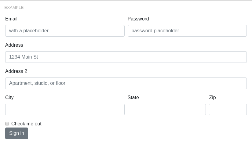
import React from 'react';import { Col, Row, Button, Form, FormGroup, Label, Input, FormText } from 'reactstrap';export default class Example extends React.Component { render() { return ( <Form> <Row form> <Col md={6}> <FormGroup> <Label for="exampleEmail">Email</Label> <Input type="email" name="email" id="exampleEmail" placeholder="with a placeholder" /> </FormGroup> </Col> <Col md={6}> <FormGroup> <Input type="password" name="password" id="examplePassword" placeholder="password placeholder" /> </FormGroup> </Col> </Row> <FormGroup> <Label for="exampleAddress">Address</Label> <Input type="text" name="address" id="exampleAddress" placeholder="1234 Main St"/> <FormGroup> <Label for="exampleAddress2">Address 2</Label> <Input type="text" name="address2" id="exampleAddress2" placeholder="Apartment, studio, or floor"/> </FormGroup> <Row form> <Col md={6}> <FormGroup> <Label for="exampleCity">City</Label> <Input type="text" name="city" id="exampleCity"/> </FormGroup> </Col> <Col md={4}> <FormGroup> <Label for="exampleState">State</Label> <Input type="text" name="state" id="exampleState"/> </FormGroup> </Col> <Col md={2}> <FormGroup> <Label for="exampleZip">Zip</Label> <Input type="text" name="zip" id="exampleZip"/> </FormGroup> </Col> </Row> <FormGroup check> <Input type="checkbox" name="check" id="exampleCheck"/> <Label for="exampleCheck" check>Check me out</Label> </FormGroup> <Button>Sign in</Button> </Form> ); }}
Form Validation
import React from 'react';import { Form, FormGroup, Label, Input, FormFeedback, FormText } from 'reactstrap';export default class Example extends React.Component { render() { return ( <Form> <FormGroup> <Label for="exampleEmail">Input without validation</Label> <Input /> <FormFeedback>You will not be able to see this</FormFeedback> <FormText>Example help text that remains unchanged.</FormText> </FormGroup> <FormGroup> <Label for="exampleEmail">Valid input</Label> <Input valid /> <FormFeedback valid>Sweet! that name is available</FormFeedback> <FormText>Example help text that remains unchanged.</FormText> </FormGroup> <FormGroup> <Label for="examplePassword">Invalid input</Label> <Input invalid /> <FormFeedback>Oh noes! that name is already taken</FormFeedback> <FormText>Example help text that remains unchanged.</FormText> </FormGroup> <FormGroup> <Label for="exampleEmail">Input without validation</Label> <Input /> <FormFeedback tooltip>You will not be able to see this</FormFeedback> <FormText>Example help text that remains unchanged.</FormText> </FormGroup> <FormGroup> <Label for="exampleEmail">Valid input</Label> <Input valid /> <FormFeedback valid tooltip>Sweet! that name is available</FormFeedback> <FormText>Example help text that remains unchanged.</FormText> </FormGroup> <FormGroup> <Label for="examplePassword">Invalid input</Label> <Input invalid /> <FormFeedback tooltip>Oh noes! that name is already taken</FormFeedback> <FormText>Example help text that remains unchanged.</FormText> </FormGroup> </Form> ); }}
Input Types
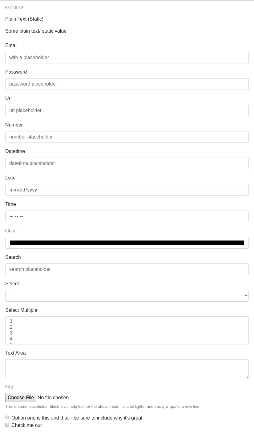
import React from 'react';import { Button, Form, FormGroup, Label, Input, FormText } from 'reactstrap';export default class Example extends React.Component { render() { return ( <Form> <FormGroup> <Label for="exampleEmail">Plain Text (Static)</Label> <Input plaintext value="Some plain text/ static value" /> </FormGroup> <FormGroup> <Label for="exampleEmail">Email</Label> <Input type="email" name="email" id="exampleEmail" placeholder="with a placeholder" /> </FormGroup> <FormGroup> <Label for="examplePassword">Password</Label> <Input type="password" name="password" id="examplePassword" placeholder="password placeholder" /> </FormGroup> <FormGroup> <Label for="exampleUrl">Url</Label> <Input type="url" name="url" id="exampleUrl" placeholder="url placeholder" /> </FormGroup> <FormGroup> <Label for="exampleNumber">Number</Label> <Input type="number" name="number" id="exampleNumber" placeholder="number placeholder" /> </FormGroup> <FormGroup> <Label for="exampleDatetime">Datetime</Label> <Input type="datetime" name="datetime" id="exampleDatetime" placeholder="datetime placeholder" /> </FormGroup> <FormGroup> <Label for="exampleDate">Date</Label> <Input type="date" name="date" id="exampleDate" placeholder="date placeholder" /> </FormGroup> <FormGroup> <Label for="exampleTime">Time</Label> <Input type="time" name="time" id="exampleTime" placeholder="time placeholder" /> </FormGroup> <FormGroup> <Label for="exampleColor">Color</Label> <Input type="color" name="color" id="exampleColor" placeholder="color placeholder" /> </FormGroup> <FormGroup> <Label for="exampleSearch">Search</Label> <Input type="search" name="search" id="exampleSearch" placeholder="search placeholder" /> </FormGroup> <FormGroup> <Label for="exampleSelect">Select</Label> <Input type="select" name="select" id="exampleSelect"> <option>1</option> <option>2</option> <option>3</option> <option>4</option> <option>5</option> </Input> </FormGroup> <FormGroup> <Label for="exampleSelectMulti">Select Multiple</Label> <Input type="select" name="selectMulti" id="exampleSelectMulti" multiple > <option>1</option> <option>3</option> <option>4</option> <option>5</option> </FormGroup> <FormGroup> <Label for="exampleText">Text Area</Label> <Input type="textarea" name="text" id="exampleText" /> </FormGroup> <FormGroup> <Label for="exampleFile">File</Label> <Input type="file" name="file" id="exampleFile" /> <FormText color="muted"> This is some placeholder block-level help text for the above input. It's a bit lighter and easily wraps to a new line. </FormText> </FormGroup> <FormGroup check> <Label check> <Input type="radio" /> Option one is this and that—be sure to include why it's great </Label> </FormGroup> <FormGroup check> <Label check> <Input type="checkbox" /> Check me out </Label> </FormGroup> </Form> ); }}
import React from 'react';import { Form, FormGroup, Label, Input } from 'reactstrap';export default class Example extends React.Component { render() { return ( <Form> <FormGroup check inline> <Label check> <Input type="checkbox" /> Some input </Label> </FormGroup> <FormGroup check inline> <Label check> <Input type="checkbox" /> Some other input </Label> </FormGroup> </Form> ); }}
Input Sizing
Input Grid Sizing
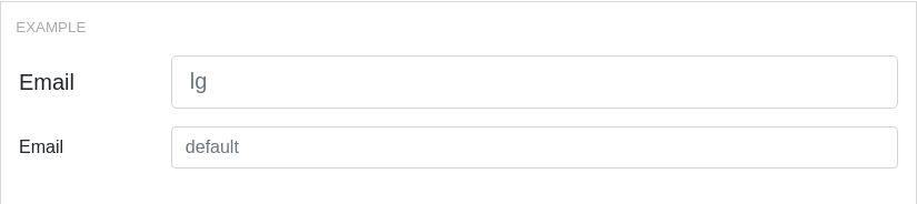
import React from 'react';import { Col, Form, FormGroup, Label, Input } from 'reactstrap';export default class Example extends React.Component { render() { return ( <Form> <FormGroup row> <Label for="exampleEmail" sm={2} size="lg">Email</Label> <Col sm={10}> <Input type="email" name="email" id="exampleEmail" placeholder="lg" bsSize="lg" /> </Col> </FormGroup> <FormGroup row> <Label for="exampleEmail2" sm={2}>Email</Label> <Col sm={10}> <Input type="email" name="email" id="exampleEmail2" placeholder="default" /> </Col> </FormGroup> </Form> ); }}
import React from 'react';import { Button, Form, FormGroup, Label, Input } from 'reactstrap';export default class Example extends React.Component { render() { return ( <Form inline> <FormGroup> <Label for="exampleEmail" hidden>Email</Label> <Input type="email" name="email" id="exampleEmail" placeholder="Email" /> </FormGroup> {' '} <FormGroup> <Label for="examplePassword" hidden>Password</Label> <Input type="password" name="password" id="examplePassword" placeholder="Password" /> </FormGroup> {' '} <Button>Submit</Button> </Form> ); }}
Custom Inputs
import React from 'react';import { CustomInput, Form, FormGroup, Label } from 'reactstrap';export default class Example extends React.Component { render() { return ( <Form> <FormGroup> <Label for="exampleCheckbox">Checkboxes</Label> <div> <CustomInput type="checkbox" id="exampleCustomCheckbox" label="Check this custom checkbox" /> <CustomInput type="checkbox" id="exampleCustomCheckbox2" label="Or this one" /> <CustomInput type="checkbox" id="exampleCustomCheckbox3" label="But not this disabled one" disabled /> <CustomInput type="checkbox" id="exampleCustomCheckbox4" label="Can't click this label to check!" htmlFor="exampleCustomCheckbox4_X" disabled /> </div> </FormGroup> <FormGroup> <Label for="exampleCheckbox">Radios</Label> <div> <CustomInput type="radio" id="exampleCustomRadio" name="customRadio" label="Select this custom radio" /> <CustomInput type="radio" id="exampleCustomRadio2" name="customRadio" label="Or this one" /> <CustomInput type="radio" id="exampleCustomRadio3" label="But not this disabled one" disabled /> <CustomInput type="radio" id="exampleCustomRadio4" label="Can't click this label to select!" htmlFor="exampleCustomRadio4_X" disabled /> </div> </FormGroup> <FormGroup> <Label for="exampleCheckbox">Switches</Label> <div> <CustomInput type="switch" id="exampleCustomSwitch" name="customSwitch" label="Turn on this custom switch" /> <CustomInput type="switch" id="exampleCustomSwitch2" name="customSwitch" label="Or this one" /> <CustomInput type="switch" id="exampleCustomSwitch3" label="But not this disabled one" disabled /> <CustomInput type="switch" id="exampleCustomSwitch4" label="Can't click this label to turn on!" htmlFor="exampleCustomSwitch4_X" disabled /> </div> </FormGroup> <FormGroup> <Label for="exampleCheckbox">Inline</Label> <div> <CustomInput type="checkbox" id="exampleCustomInline" label="An inline custom input" inline /> <CustomInput type="checkbox" id="exampleCustomInline2" label="and another one" inline /> </div> </FormGroup> <FormGroup> <Label for="exampleCustomSelect">Custom Select</Label> <CustomInput type="select" id="exampleCustomSelect" name="customSelect"> <option value="">Select</option> <option>Value 1</option> <option>Value 2</option> <option>Value 3</option> <option>Value 4</option> <option>Value 5</option> </CustomInput> </FormGroup> <FormGroup> <Label for="exampleCustomMutlipleSelect">Custom Multiple Select</Label> <CustomInput type="select" id="exampleCustomMutlipleSelect" name="customSelect" multiple> <option value="">Select</option> <option>Value 1</option> <option>Value 2</option> <option>Value 3</option> <option>Value 4</option> <option>Value 5</option> </CustomInput> </FormGroup> <FormGroup> <Label for="exampleCustomSelectDisabled">Custom Select Disabled</Label> <CustomInput type="select" id="exampleCustomSelectDisabled" name="customSelect" disabled> <option value="">Select</option> <option>Value 1</option> <option>Value 2</option> <option>Value 3</option> <option>Value 4</option> <option>Value 5</option> </CustomInput> </FormGroup> <FormGroup> <Label for="exampleCustomMutlipleSelectDisabled">Custom Multiple Select Disabled</Label> <CustomInput type="select" id="exampleCustomMutlipleSelectDisabled" name="customSelect" multiple disabled> <option value="">Select</option> <option>Value 1</option> <option>Value 2</option> <option>Value 3</option> <option>Value 4</option> <option>Value 5</option> </CustomInput> </FormGroup> <FormGroup> <Label for="exampleCustomFileBrowser">File Browser</Label> <CustomInput type="file" id="exampleCustomFileBrowser" name="customFile" /> </FormGroup> <FormGroup> <Label for="exampleCustomFileBrowser">File Browser with Custom Label</Label> <CustomInput type="file" id="exampleCustomFileBrowser" name="customFile" label="Yo, pick a file!" /> </FormGroup> <FormGroup> <Label for="exampleCustomFileBrowser">File Browser Disabled</Label> <CustomInput type="file" id="exampleCustomFileBrowser" name="customFile" disabled /> </FormGroup> </Form> ); }}

 我的书签
我的书签
 添加书签
添加书签 移除书签
移除书签
