
seaborn.pairplot
By default, this function will create a grid of Axes such that each variable in will by shared in the y-axis across a single row and in the x-axis across a single column. The diagonal Axes are treated differently, drawing a plot to show the univariate distribution of the data for the variable in that column.
It is also possible to show a subset of variables or plot different variables on the rows and columns.
This is a high-level interface for that is intended to make it easy to draw a few common styles. You should use PairGrid directly if you need more flexibility.
参数:data:DataFrame
hue:string (variable name), optional
Variable in
datato map plot aspects to different colors.
hue_order:list of strings
Order for the levels of the hue variable in the palette
palette:dict or seaborn color palette
Set of colors for mapping the
huevariable. If a dict, keys should be values in thehuevariable.
vars:list of variable names, optional
:lists of variable names, optional
Variables within
datato use separately for the rows and columns of the figure; i.e. to make a non-square plot.
kind:{‘scatter’, ‘reg’}, optional
Kind of plot for the non-identity relationships.
Kind of plot for the diagonal subplots. The default depends on whether
"hue"is used or not.
markers:single matplotlib marker code or list, optional
height:scalar, optional
Height (in inches) of each facet.
aspect:scalar, optional
Aspect * height gives the width (in inches) of each facet.
dropna:boolean, optional
Drop missing values from the data before plotting.
{plot, diag, grid}_kws:dicts, optional
返回值:grid:PairGrid
Returns the underlying
PairGridinstance for further tweaking.
See also
Subplot grid for more flexible plotting of pairwise relationships.
Examples
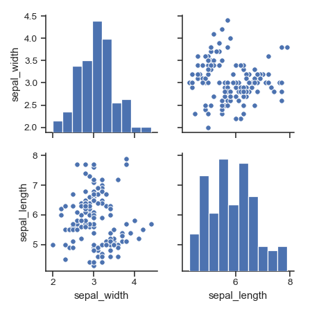
Draw scatterplots for joint relationships and histograms for univariate distributions:
>>> iris = sns.load_dataset("iris")>>> g = sns.pairplot(iris)
Show different levels of a categorical variable by the color of plot elements:
Use a different color palette:

Use different markers for each level of the hue variable:
>>> g = sns.pairplot(iris, hue="species", markers=["o", "s", "D"])
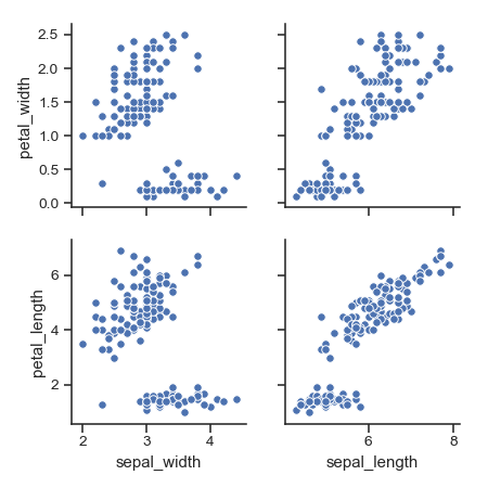
Plot a subset of variables:
>>> g = sns.pairplot(iris, vars=["sepal_width", "sepal_length"])
Draw larger plots:
Plot different variables in the rows and columns:
>>> g = sns.pairplot(iris,... y_vars=["petal_width", "petal_length"])
Use kernel density estimates for univariate plots:
>>> g = sns.pairplot(iris, diag_kind="kde")
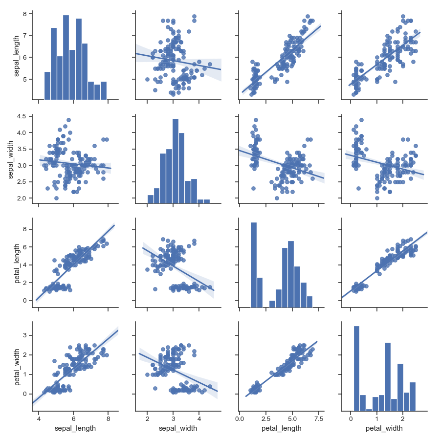
Fit linear regression models to the scatter plots:
Pass keyword arguments down to the underlying functions (it may be easier to use directly):
>>> g = sns.pairplot(iris, diag_kind="kde", markers="+",... diag_kws=dict(shade=True))

