
seaborn.lineplot
The relationship between and y can be shown for different subsets of the data using the hue, size, and style parameters. These parameters control what visual semantics are used to identify the different subsets. It is possible to show up to three dimensions independently by using all three semantic types, but this style of plot can be hard to interpret and is often ineffective. Using redundant semantics (i.e. both hue and style for the same variable) can be helpful for making graphics more accessible.
See the for more information.
By default, the plot aggregates over multiple y values at each value of x and shows an estimate of the central tendency and a confidence interval for that estimate.
参数:x, y:names of variables in data or vector data, optional
hue:name of variables in data or vector data, optional
Grouping variable that will produce lines with different colors. Can be either categorical or numeric, although color mapping will behave differently in latter case.
size:name of variables in data or vector data, optional
Grouping variable that will produce lines with different widths. Can be either categorical or numeric, although size mapping will behave differently in latter case.
style:name of variables in data or vector data, optional
Grouping variable that will produce lines with different dashes and/or markers. Can have a numeric dtype but will always be treated as categorical.
data:DataFrame
Tidy (“long-form”) dataframe where each column is a variable and each row is an observation.
palette:palette name, list, or dict, optional
Colors to use for the different levels of the
huevariable. Should be something that can be interpreted bycolor_palette(), or a dictionary mapping hue levels to matplotlib colors.
hue_order:list, optional
Specified order for the appearance of the
huevariable levels, otherwise they are determined from the data. Not relevant when thehuevariable is numeric.
hue_norm:tuple or Normalize object, optional
Normalization in data units for colormap applied to the
huevariable when it is numeric. Not relevant if it is categorical.
sizes:list, dict, or tuple, optional
size_order:list, optional
Specified order for appearance of the
sizevariable levels, otherwise they are determined from the data. Not relevant when thesizevariable is numeric.
size_norm:tuple or Normalize object, optional
Normalization in data units for scaling plot objects when the
sizevariable is numeric.
dashes:boolean, list, or dictionary, optional
Object determining how to draw the lines for different levels of the
stylevariable. Setting toTruewill use default dash codes, or you can pass a list of dash codes or a dictionary mapping levels of the variable to dash codes. Setting toFalsewill use solid lines for all subsets. Dashes are specified as in matplotlib: a tuple of(segment, gap)lengths, or an empty string to draw a solid line.
markers:boolean, list, or dictionary, optional
Object determining how to draw the markers for different levels of the
stylevariable. Setting toTruewill use default markers, or you can pass a list of markers or a dictionary mapping levels of thestylevariable to markers. Setting toFalsewill draw marker-less lines. Markers are specified as in matplotlib.
Specified order for appearance of the
stylevariable levels otherwise they are determined from the data. Not relevant when thestylevariable is numeric.
units:{long_form_var}
Grouping variable identifying sampling units. When used, a separate line will be drawn for each unit with appropriate semantics, but no legend entry will be added. Useful for showing distribution of experimental replicates when exact identities are not needed.
estimator:name of pandas method or callable or None, optional
Method for aggregating across multiple observations of the
yvariable at the samexlevel. IfNone, all observations will be drawn.
ci:int or “sd” or None, optional
n_boot:int, optional
Number of bootstraps to use for computing the confidence interval.
sort:boolean, optional
If True, the data will be sorted by the x and y variables, otherwise lines will connect points in the order they appear in the dataset.
err_style:“band” or “bars”, optional
Whether to draw the confidence intervals with translucent error bands or discrete error bars.
err_band:dict of keyword arguments
Additional paramters to control the aesthetics of the error bars. The kwargs are passed either to
ax.fill_betweenorax.errorbar, depending on theerr_style.
legend:“brief”, “full”, or False, optional
How to draw the legend. If “brief”, numeric
hueandsizevariables will be represented with a sample of evenly spaced values. If “full”, every group will get an entry in the legend. IfFalse, no legend data is added and no legend is drawn.
ax:matplotlib Axes, optional
Axes object to draw the plot onto, otherwise uses the current Axes.
kwargs:key, value mappings
Other keyword arguments are passed down to
plt.plotat draw time.
返回值:ax:matplotlib Axes
See also
Show the relationship between two variables without emphasizing continuity of the x variable.Show the relationship between two variables when one is categorical.
Examples
Draw a single line plot with error bands showing a confidence interval:
>>> import seaborn as sns; sns.set()>>> import matplotlib.pyplot as plt>>> fmri = sns.load_dataset("fmri")>>> ax = sns.lineplot(x="timepoint", y="signal", data=fmri)
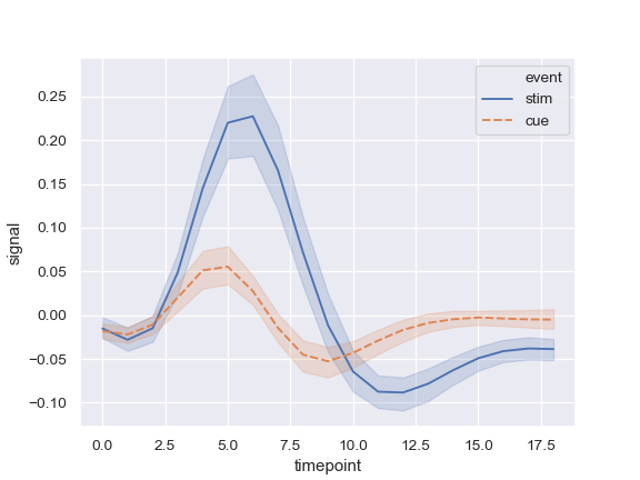
Group by another variable and show the groups with different colors:
>>> ax = sns.lineplot(x="timepoint", y="signal", hue="event",
Show the grouping variable with both color and line dashing:
>>> ax = sns.lineplot(x="timepoint", y="signal",... hue="event", style="event", data=fmri)
Use color and line dashing to represent two different grouping variables:
>>> ax = sns.lineplot(x="timepoint", y="signal",... hue="region", style="event", data=fmri)
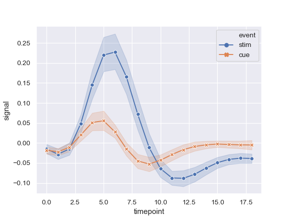
Use markers instead of the dashes to identify groups:
>>> ax = sns.lineplot(x="timepoint", y="signal",... hue="event", style="event",... markers=True, dashes=False, data=fmri)
Show error bars instead of error bands and plot the standard error:
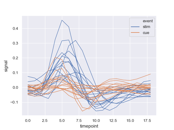
Show experimental replicates instead of aggregating:
>>> ax = sns.lineplot(x="timepoint", y="signal", hue="event",... data=fmri.query("region == 'frontal'"))
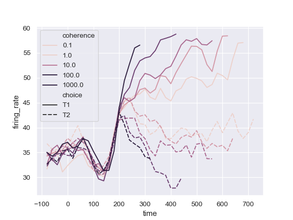
Use a quantitative color mapping:
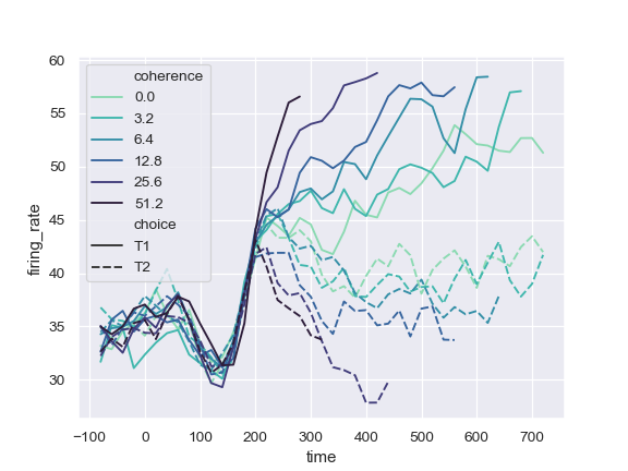
>>> dots = sns.load_dataset("dots").query("align == 'dots'")>>> ax = sns.lineplot(x="time", y="firing_rate",... hue="coherence", style="choice",... data=dots)
Use a different normalization for the colormap:
>>> from matplotlib.colors import LogNorm>>> ax = sns.lineplot(x="time", y="firing_rate",... hue="coherence", style="choice",... hue_norm=LogNorm(), data=dots)
Use a different color palette:
>>> ax = sns.lineplot(x="time", y="firing_rate",... hue="coherence", style="choice",... palette="ch:2.5,.25", data=dots)
Use specific color values, treating the hue variable as categorical:
>>> palette = sns.color_palette("mako_r", 6)>>> ax = sns.lineplot(x="time", y="firing_rate",... palette=palette, data=dots)
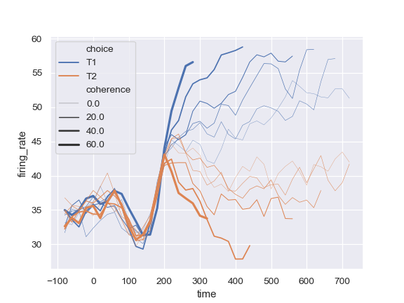
Change the width of the lines with a quantitative variable:
Change the range of line widths used to normalize the size variable:
>>> ax = sns.lineplot(x="time", y="firing_rate",... size="coherence", hue="choice",... sizes=(.25, 2.5), data=dots)
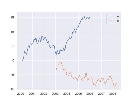
Plot from a wide-form DataFrame:
>>> import numpy as np, pandas as pd; plt.close("all")>>> index = pd.date_range("1 1 2000", periods=100,... freq="m", name="date")>>> data = np.random.randn(100, 4).cumsum(axis=0)>>> wide_df = pd.DataFrame(data, index, ["a", "b", "c", "d"])>>> ax = sns.lineplot(data=wide_df)
Plot from a list of Series:
>>> list_data = [wide_df.loc[:"2005", "a"], wide_df.loc["2003":, "b"]]>>> ax = sns.lineplot(data=list_data)
Plot a single Series, pass kwargs to plt.plot:
>>> ax = sns.lineplot(data=wide_df["a"], color="coral", label="line")
Draw lines at points as they appear in the dataset:

